
Insight and opinion
Component-Based Web Design
Working with new designers and developers often means throwing different ways of working into the mix. Each brings favoured tools. Each has preferred processes. It’s little wonder confusion often ensues. One answer could well be a design-development process we have recently agreed through an incredible collaboration. This is based on the decision to shift from page-based to component-based design. Let me share why we made this shift and the benefits we’re seeing.
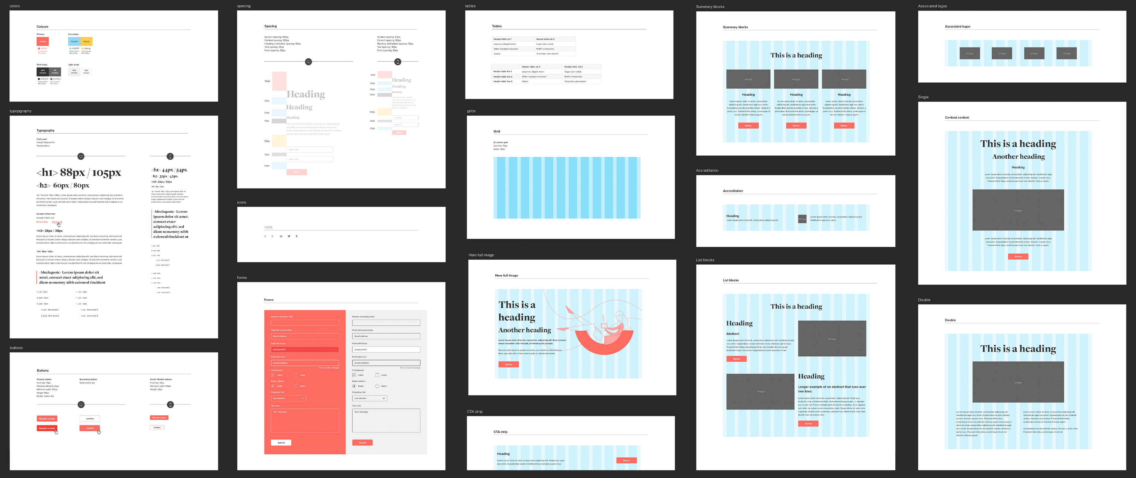
Firstly, to reach our component-based approach, we’ve taken big influences from Brad Frost’s Atomic Design pattern. In an 'atom' shell... Atomic Design is a methodology that involves breaking apart a website's layout into its basic components, so they can then be reused throughout the site. This method was coined by Brad Frost, a very awesome developer. Its intention: to improve the work flow of designers and developers in web design. Thanks Brad! These benefits can, and are, indirectly extended to our clients.
It’s becoming more and more essential that the ownership of website content lies with the client. Therefore the majority of sites that we create today involve a robust CMS (content management system) that give the power to edit content and build new page layouts.
Historically, page-based design meant looking at a website as a collection of separate page layouts that were designed then developed, often in isolation. However, with the requirement for clients to manage their own site at every level we were finding that this traditional approach needed to change to give our clients more flexibility and control over the product we were delivering.
This is where a component-based design system really comes into play. Rather than designing entire page templates to be reused throughout a site, we’re following atomic design principles to create a set of page components that can act as building blocks within a CMS.
Here’s how adopting a component-based approach to our digital projects has benefitted both Sandbox and our clients.
Happy designers and developers…
Style guides are easy yet essential
This approach enables us to easily build up a digital style guide before creating the site. This contains details of mobile typography rules, button states, form styling, spacing rules etc.
Stronger branding
The style guides dictate how every element within a component should look. This is always carefully considered to reflect the brand. Sticking closely to these designed UI elements, they unintentionally police the brand. Consistent styling means a stronger brand identity throughout the digital experience
Mix and match = faster prototyping
With a style guide in place detailing the design of each UI element we can quickly create very usable web page layouts by duplicating and combining components together. This leads to faster prototyping of new page designs.
Leaner development
Components provide better collaboration between design and development and encourage a streamlined work flow. Having a definitive style guide that everyone follows means you’re coding a core set of UI elements once, that get reused in multiple places. The code is leaner and easy to return to when updates are required.
Happy clients…
Greater flexibility
We’re essentially giving you a CMS toolkit of designed and coded components that you can mix and match to create new layouts very quickly. This extra control means you’re not stuck with a whole page template to shoe horn your content into – you can pick and choose components to best suit the page content you have.
Consistent interfaces
Once we handover the site, you’re responsible for maintaining things. Often, the involvement of multiple team members can mean the site soon turns into a mash up of page designs. However, with the fixed but flexible components – whatever changes you make will stay true to your brand styling.
Lower maintenance costs
Because the site consists of a set number of components, if there is a problem or a change required then you don’t need to pay to fix every occurrence as it’s one code base that cascades throughout.
Higher conversions
This in turn means that your consistent UI will be recognisable and understandable as visitors navigate the site, and therefore more usable. Happier customers that don’t have to think about using your site will reach their destination faster and be more likely to convert.
This component-based approach has transformed our designer/developer workflow. Rather than handing designs over to a developer it is a constant conversation with continual collaboration which can only end well.
Of course, the other great side-effect is that our clients feel the benefit through the products we deliver. A strongly branded website and a consistent user experience with a hugely customisable CMS behind it.
Read about the OpenWrks website that we created using this approach.